Fixed-Height Cards: Navigating Their Limitations in Design
|5 min read
Understanding the Pitfalls of Fixed-Height Card Layouts
Fixed-height card designs often seem like a straightforward solution. After all, a designer presents a neat grid where each card harmonizes in size and shape, making for a visually appealing interface. Titles are succinct, and content fits well, leading many developers to implement the design precisely as outlined. This is the type of layout that can leave one feeling confident as it checks all the right boxes—at least on the surface.
However, the trouble starts as soon as content fluctuates. Editors revise text, translations require longer phrases, and accessibility adjustments prompt users to enlarge their font sizes. While these changes might seem insignificant, they can wreak havoc on a layout that was predicated on static dimensions. I encountered this dilemma firsthand while constructing a “Recent Articles” section for a blog. The design assumed uniform, short titles in English, leading to an initial fluid layout that soon crumbled under the strain of variable content.
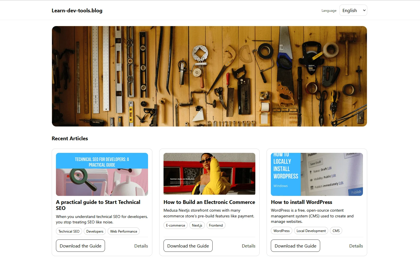
At first, the layout appeared solid.
Initial design
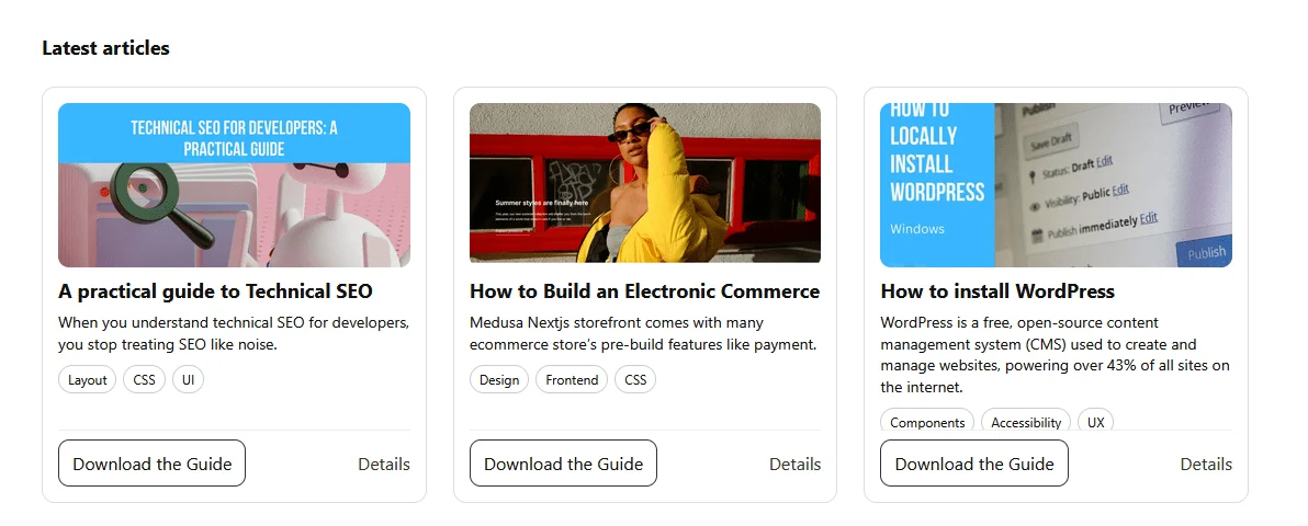
But once content varying in length was introduced—like translating from English to French—the problems became apparent:
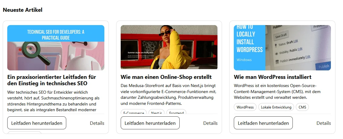
When German translations were implemented, the layout experienced even greater strain:
More layout failures
What initially seemed like a stable design quickly revealed its vulnerabilities, primarily due to a misguided assumption: that content would always conform to a fixed height.
Clearly, this design philosophy hinges on an unstable foundation: the notion that contents can be rigidly contained within an arbitrarily defined vertical space. This illusion of control is often deceptive, as it masks the inherent unpredictability of dynamic content.
If you’re navigating the often treacherous waters of web design, you’ll want to remain alert to how layout elements react under real-world conditions. The static constraints of fixed dimensions can easily lead to clashes and unexpected overflow, illuminating how fragile such layouts truly are. You’d do well to consider options that allow for adaptability rather than prescribing strict limitations, thereby ensuring your design can withstand the unpredictability of user input and diverse content types.
Embracing Flexibility in Design
The evolution of web components hinges on a pivotal realization: rigidity often leads to vulnerability. A classic trap in UI design is to assume content will conform to predefined dimensions—a perilous gamble. The original layout of the card faltered not due to a technological shortcoming, but because it made implicit assumptions about content length and formatting that were never universally valid. Titles required two lines, excerpts four, and user settings were expected to remain static. When those unwritten rules were disregarded, the layout crumbled.
What this points to is a deep-seated issue in web design: projects frequently suffocate under the weight of unchallengeable assumptions. The moment the content strays from these arbitrary confines, flaws surface—layout misalignments, overflow issues, and ultimately a user experience that falls flat. The moment I removed these fixed heights and restrictive guidelines in rebuilding the component, it was like lifting a heavy burden. The new design adapts fluidly to content variations, showcasing a critical truth: flexibility fosters stability.
A Lesson in Dynamic Sizing
It's fascinating how embracing intrinsic sizes can revolutionize content handling. You lose the constant anxiety over the logistical nightmare of string lengths and font variations. Trusting the browser to manage layout means the design can breathe and evolve with varying content. The final demonstration encapsulates this shift perfectly—loading a scenario with longer text and missing elements to mimic real-world strain rather than hypothetical perfection.
This is an important insight. Constraints meant to safeguard the design can, ironically, expose weaknesses. Truncating content should serve a purpose—not just a makeshift solution to prevent breaking layouts. In the grand scheme, letting the browser manage these aspects often yields a more resilient structure.
When to Rein in the Fixed Heights
Now, let's not dismiss fixed heights entirely; they still serve a purpose in certain contexts. However, the key takeaway is understanding when they signify a flawed approach. If you find yourself obsessing over content flow and forcing elements to conform, it’s time to reevaluate your strategy. The more you allow the browser to handle sizing, the more adaptable your designs become.
Ultimately, this journey through responsive design serves as a reminder to those of us in the field: embracing flexibility over rigidity isn't merely about aesthetics; it results in more sustainable, resilient web interfaces. If you’re crafting user experiences, consider weaving in this insight to create layouts that don’t just survive but truly thrive under real-world application.